Now Reading: A Map for Vanishing Animals
-
01
A Map for Vanishing Animals
Sign up for the free Nautilus newsletter:
science and culture for people who love beautiful writing.
![]()
The full Nautilus archive
•
eBooks & Special Editions
•
Ad-free reading
- The full Nautilus archive
- eBooks & Special Editions
- Ad-free reading

It can be hard to grasp the larger picture of how animals are being run to extinction across the planet. For her part, author Terry Tempest Williams incants a meditation: “Say their names: great auk, passenger pigeon, Carolina parakeet, Steller’s sea cow, Caribbean monk seal, Great Plains wolf, Puerto Rican long-nosed bat, Maryland darter…” she wrote.
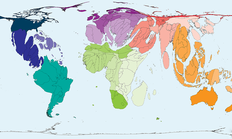
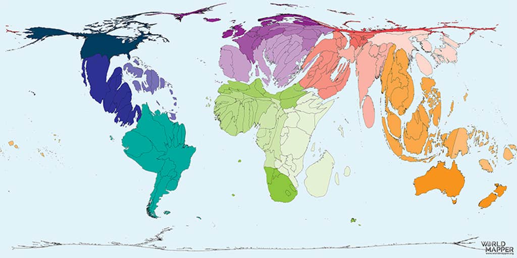
One team of geographers at the not-for-profit Worldmapper has taken a bit more of a data-crunching approach. They created these brain-bending maps to illustrate the contours of what we know about vanishing animal species.
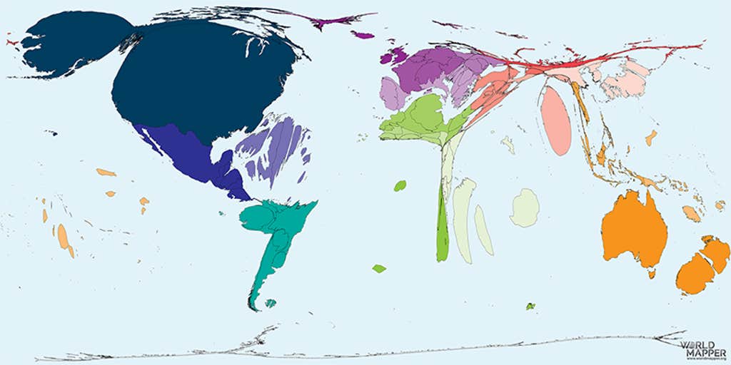
The geographers compared the number of tracked animal species in each country against the number documented to have recently gone extinct—or with a high likelihood of disappearing soon. Based on this data, which comes from the IUCN Red List (one of the most comprehensive information sources on global extinction risk, with data going back to 1996), the greater the proportion of tracked species that have gone extinct or are threatened, the larger the landmass becomes.
Plenty of caveats remain, including the certainty that many species are lost without us even knowing—and that tracking species in some places is easier than in others. But, still, the data point to a disproportionate number of losses (and likely losses) in the United States, as of 2019 (the latest year for which the data was crunched).
How can we move ahead with this knowledge? As Williams noted, on the cusp of the 50th anniversary of the signing of the Endangered Species Act by President Richard Nixon: “Grief is part of extinction that when understood and witnessed becomes an emotion that parallels love.” It’s unclear what the outlines of this love will look like when future maps are drawn. 
Lead image: Worldmapper.org
-
Katherine Harmon Courage
Posted on
Katherine Harmon Courage is the executive editor at Nautilus.
![]()
Get the Nautilus newsletter
Cutting-edge science, unraveled by the very brightest living thinkers.


Related Posts


Stay Informed With the Latest & Most Important News
Previous Post
Next Post


Advertisement