
Change isn’t always easy. Case in point: “Liquid Glass.” Apple’s upcoming “26” updates for iPhone, iPad, Mac, Apple Watch, Apple TV, and Vision Pro introduce this new design language that adds a transparent, glassy look to icons, menus, and windows. Some people are digging it, while others are hating on it. And the haters are hating.
I generally like the new look, though perhaps what I like best is that it matches across all of Apple’s products. It’s also nice to have a fresh look on Apple devices—especially the iPhone—for the first time in years. That said, I understand some of the criticisms: In the right conditions, these icons and menus look great, but depending on the background, it can be very difficult to read text or view certain elements.
Unless you download the latest Apple betas (which I don’t recommend you do), you won’t be dealing with these changes until the fall, when the company releases the official updates to the general public. But if you do decide to try out the updates at some point during the beta cycle, or you install iOS 26 or macOS Tahoe this fall and find you really can’t stand how transparent some of these windows are, there’s something you can do about it.
“Reduce Transparency”
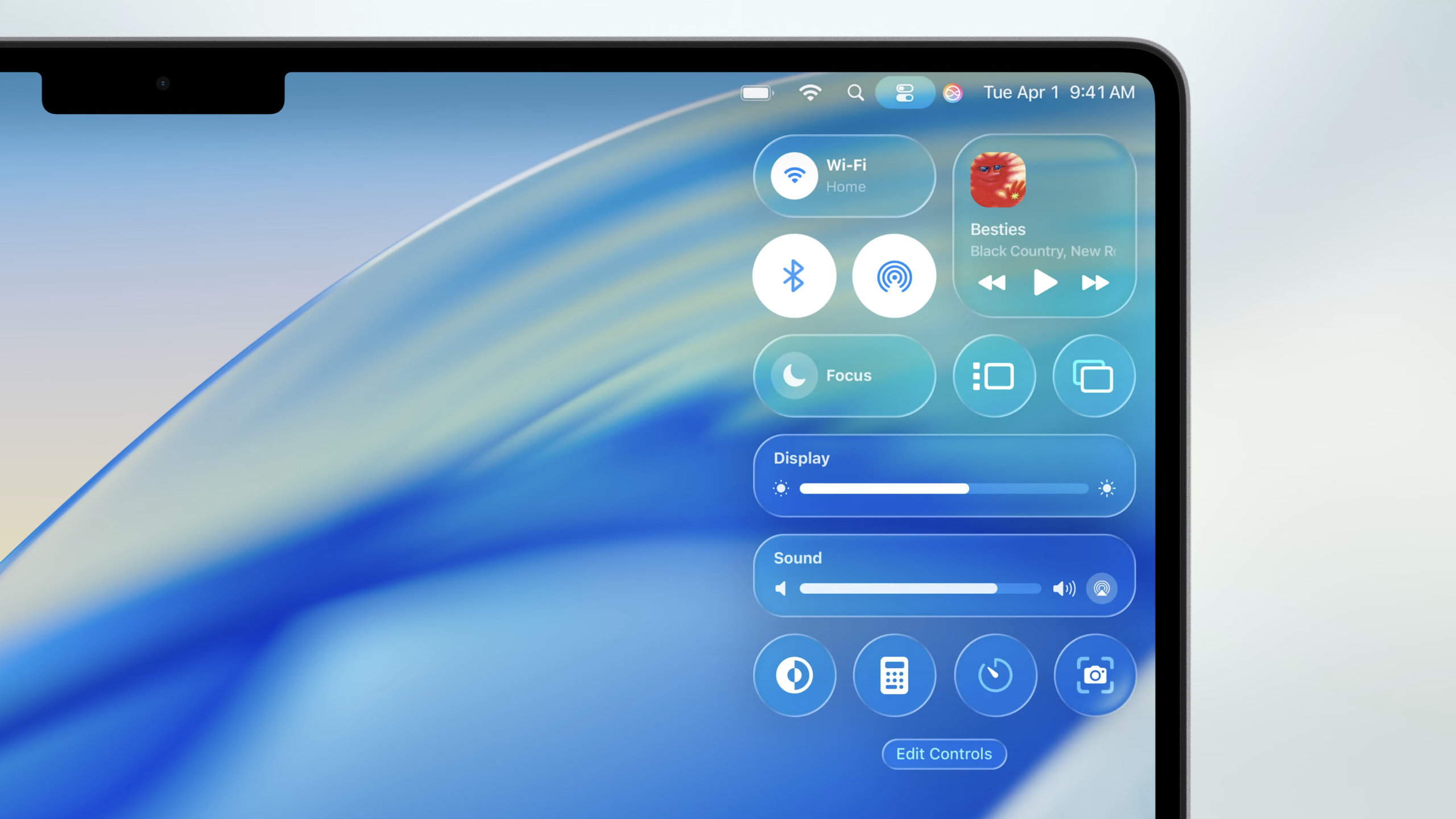
As it turns out, a setting that has existed on Apple devices for years is now responsible for limiting the effects of Liquid Glass’ most overt design: “Reduce Transparency.” This is an accessibility feature present on most Apple devices that swaps the transparent effect on some UI elements with a solid background. The idea is to boost contrast and visibility for readers who have trouble viewing items through the transparency effect, even before Liquid Glass was ever a concept.
According to users who are experimenting with the beta, toggling on Reduce Transparency goes a long way to, well, reducing the transparency of the Liquid Glass design. You can see that here: Before the setting is enabled, the menu bar lets in all the colors and graphics of the items beneath it. Once Reduce Transparency kicks in, the menu bar is much flatter, which makes the text within it (especially the artist name) much easier to read.
The Download
Never miss a tech story

Jake Peterson
Get the latest tech news, reviews, and advice from Jake and the team.
The Download
Never miss a tech story. Get the latest tech news, reviews, and advice from Jake and the team.