














Now Reading: Instagram changes wordmark after 10 years, users call it ‘Instagzam’
-
01
Instagram changes wordmark after 10 years, users call it ‘Instagzam’


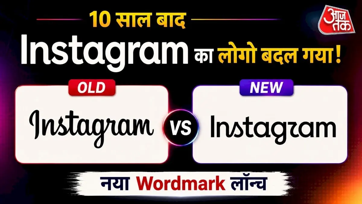
Instagram has changed its handwritten cursive wordmark for the first time in roughly 10 years. The new design is cleaner and more modern, blending cursive and print lettering. Head Adam Mosseri said…
The Story in Brief
Instagram has changed its handwritten cursive wordmark for the first time in roughly 10 years. The new design is cleaner and more modern, blending cursive and print lettering. Head Adam Mosseri said the old wordmark needed refreshing. Users on social media, especially Reddit, have mocked the new logo, with some calling it 'Instagzam' because the letters appear unclear at first glance. Others like the updated look. The camera app icon remains unchanged; this is not a full rebrand.
The Indian Opinion
The predictable outrage over a wordmark tweak shows how attached Indians are to brand nostalgia. But calling this a disaster is overblown when the iconic camera icon remains untouched. Adam Mosseri knew the memes would come. The real test is whether downloads or engagement dip in India over the next month. If not, it is just noise.
Source: aajtak.in
This story was synthesised by AI from the source linked above.