
















Now Reading: Instagram refreshes wordmark after decade, users mock ‘Instagzam’
-
01
Instagram refreshes wordmark after decade, users mock ‘Instagzam’


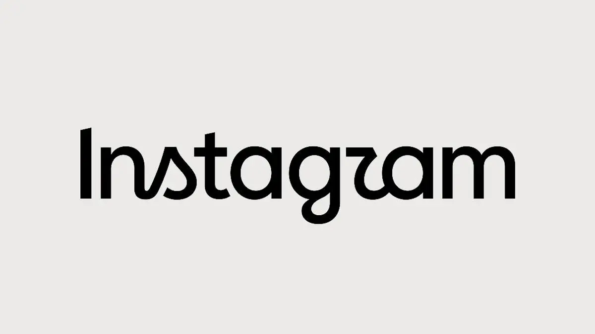
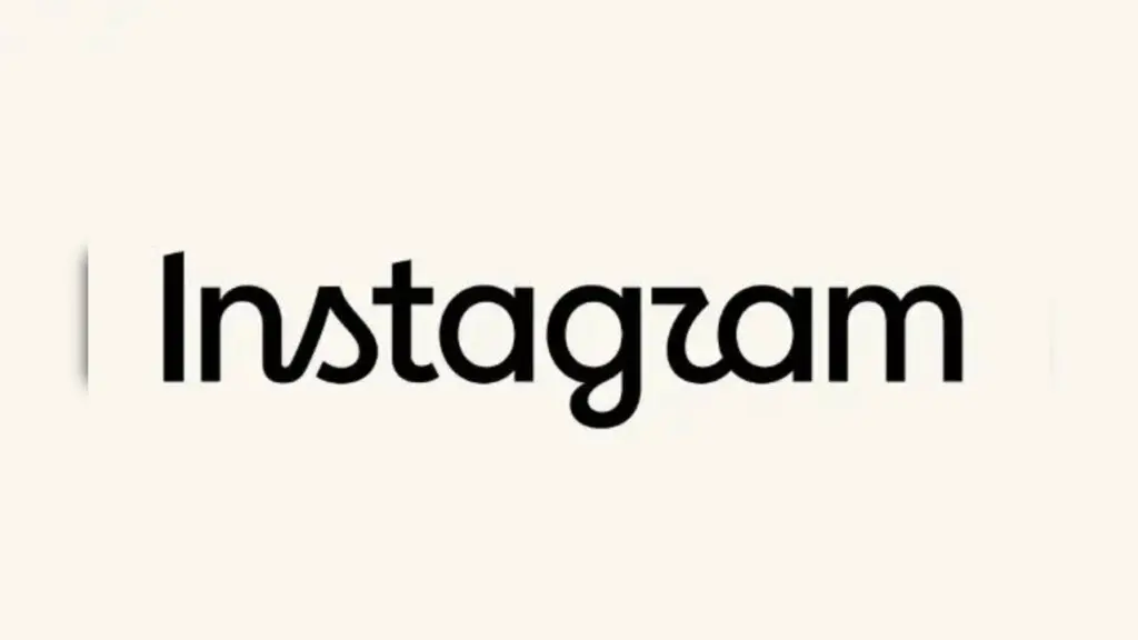
Meta introduced a refreshed Instagram wordmark on August 13, 2026, for the first time in a decade. The new design keeps the familiar script style but with redrawn letterforms. Instagram head Adam…
The Story in Brief
Meta introduced a refreshed Instagram wordmark on August 13, 2026, for the first time in a decade. The new design keeps the familiar script style but with redrawn letterforms. Instagram head Adam Mosseri described it as 'sharper and more modern'. The wordmark at the top of the app had not changed in 10 years. Many users joked that the new font makes the wordmark read as 'Instagzam' instead of Instagram. The company's iconic multicolour gradient camera icon remains unchanged. Reactions online were mixed, with some praising the cleaner look and others questioning readability.
The Indian Opinion
Internet users are quick to mock any design change, calling this another pointless rebranding. But Instagram's wordmark refresh is minor and functional. The 'Instagzam' jokes are fun but not a real critique. The old logo was outdated. The reaction is typical of social media outrage over trivial updates. The real test is whether anyone will care after a week.
Sources (2): thehindu.com, timesnownews.com
This story was synthesised by AI from the 2 sources linked above.
Updated: this story now draws on 2 sources.